Pooled light
Violet, cyan and magenta light pools across the page, over a fading dot grid.


FOR DESIGNERS AND PRODUCT TEAMS
Aster draws every pixel itself, with its own fonts. Your colours, type and motion look the same on every screen.
 Drawn by Aster
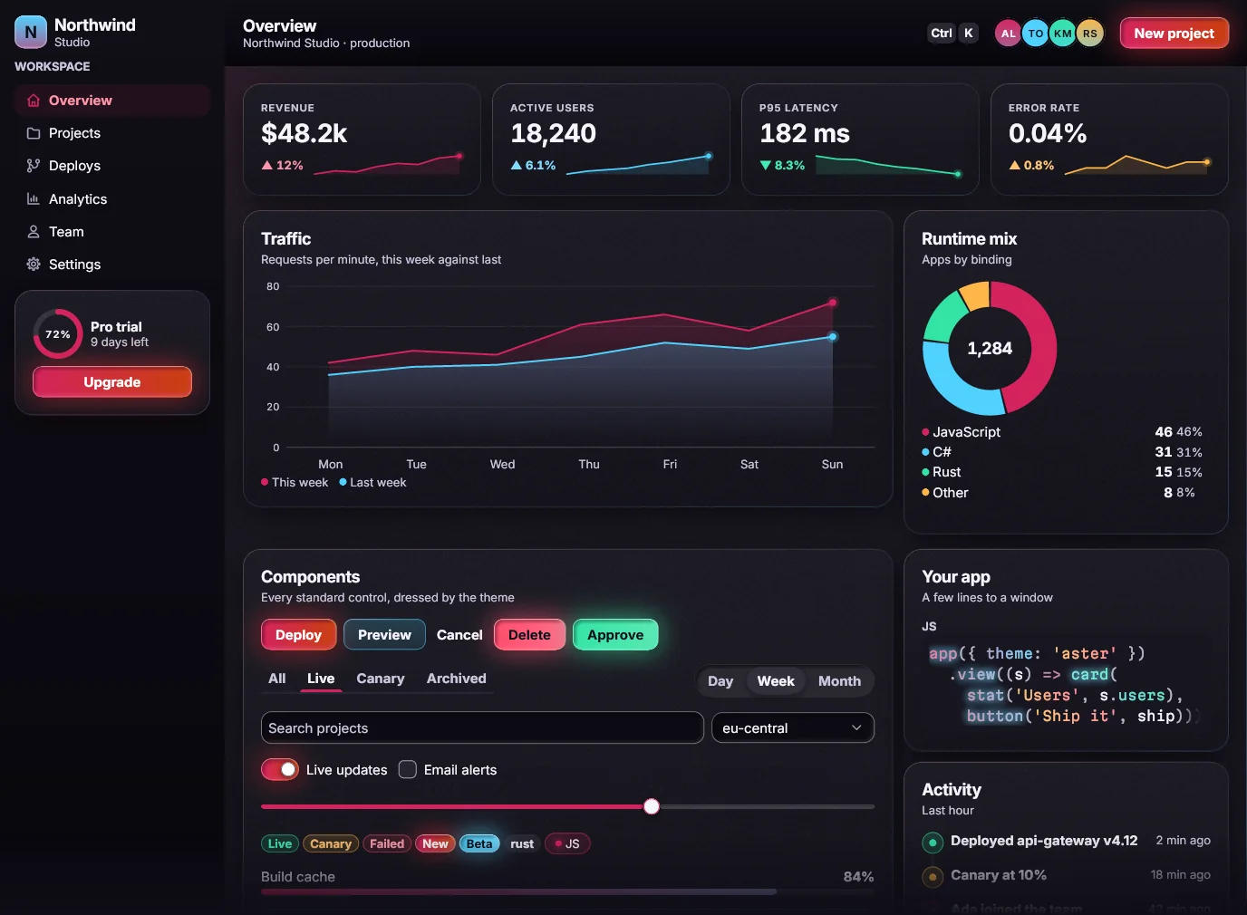
What the Aster v1 look gives you, with no extra work.
Each card has a lit rim and a soft glow, drawn pixel by pixel.
Depth without clutter: inner cards get a fainter rim.Inter, Unbounded and Martian Mono, built in. No system fonts.
Tracking tightens as the size grows.Hover, press, dialogs and toasts all move, with no setup.
Three timings, four curves. Reduced motion turns it all off.Hover and press never cost a label its contrast.
Every label 4.5:1 or better, checked on every screen.Aster's desktop build and its web build draw identical pixels.
976 of 976 frames identical: Aster's native build vs its WebAssembly build, run under Node.Render any screen, at any moment of its motion, to an image. Compare two pixel by pixel.
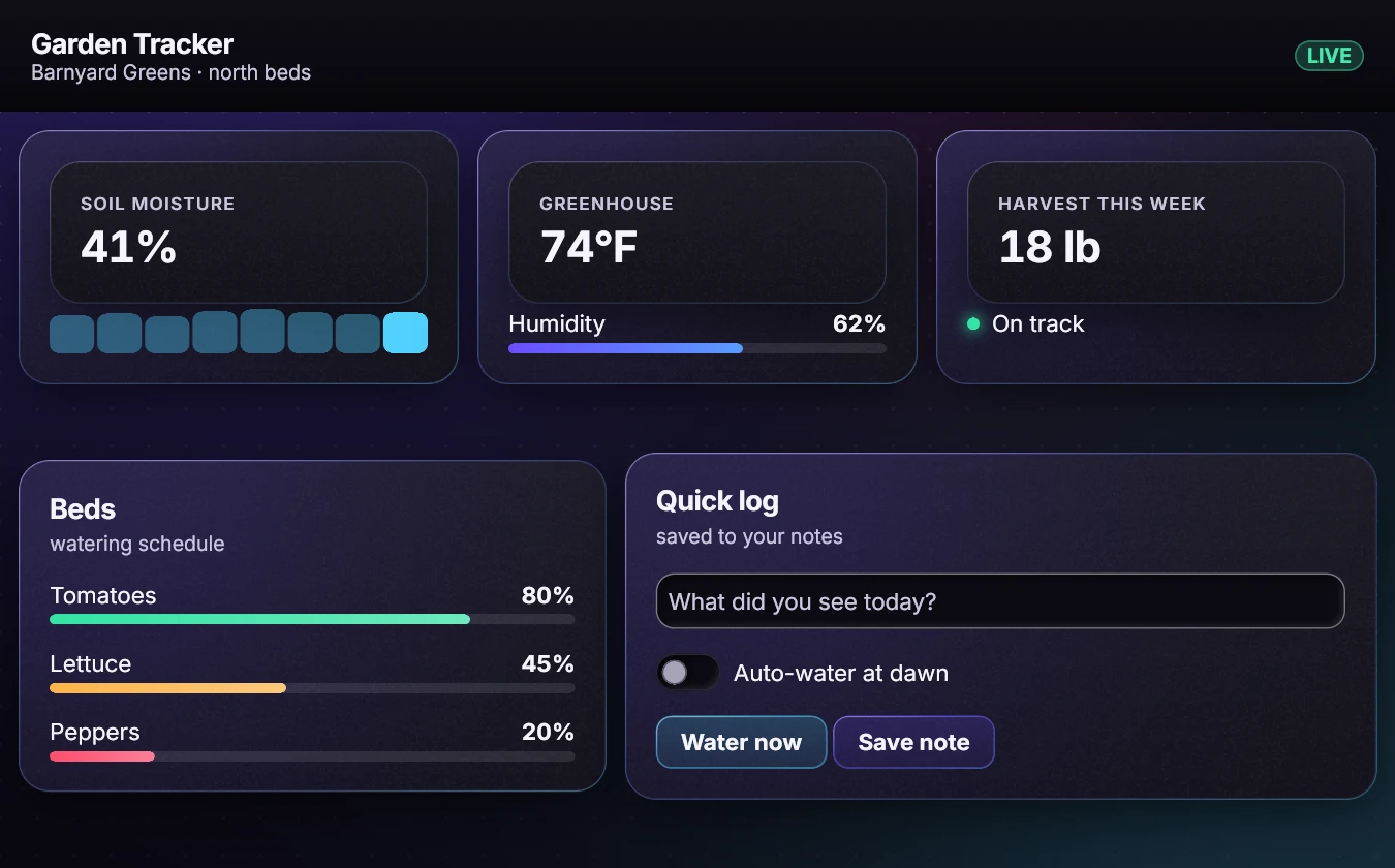
This whole gallery was rendered with no screen attached.A house look built to show what plain web styling can't: lit rims, pooled light, glowing type.
Violet, cyan and magenta light pools across the page, over a fading dot grid.
Buttons sweep violet into magenta. The gradient stops before the label gets hard to read.
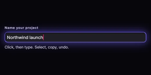
Fields and sliders sit below the page, with a soft inner shadow.
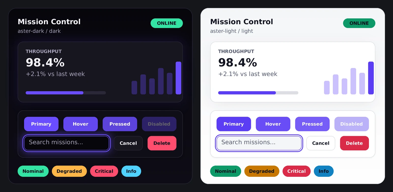
One look, dark by default, with a daylight version of the same light.
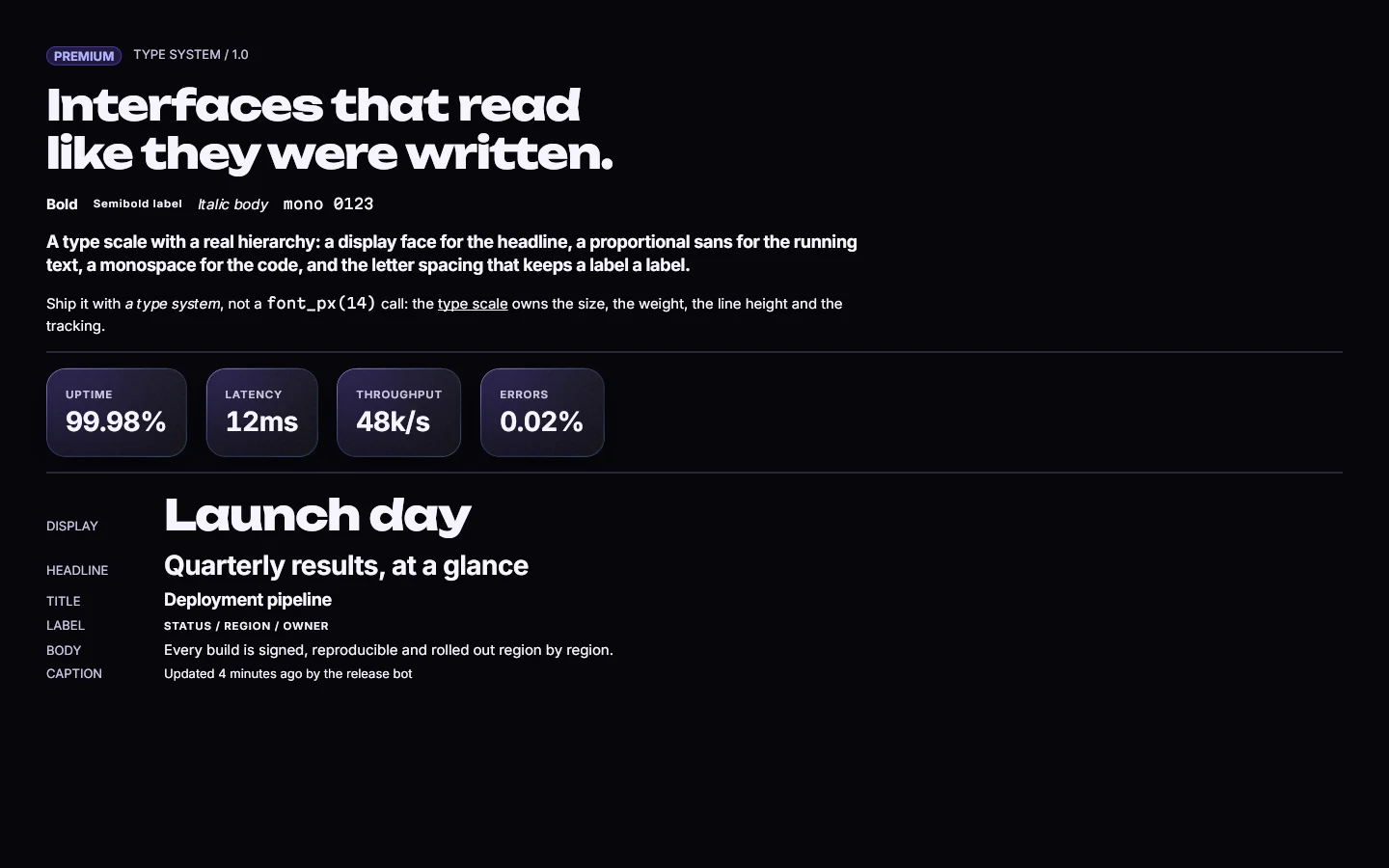
Warning amber and danger red adjust themselves wherever they're used as text.
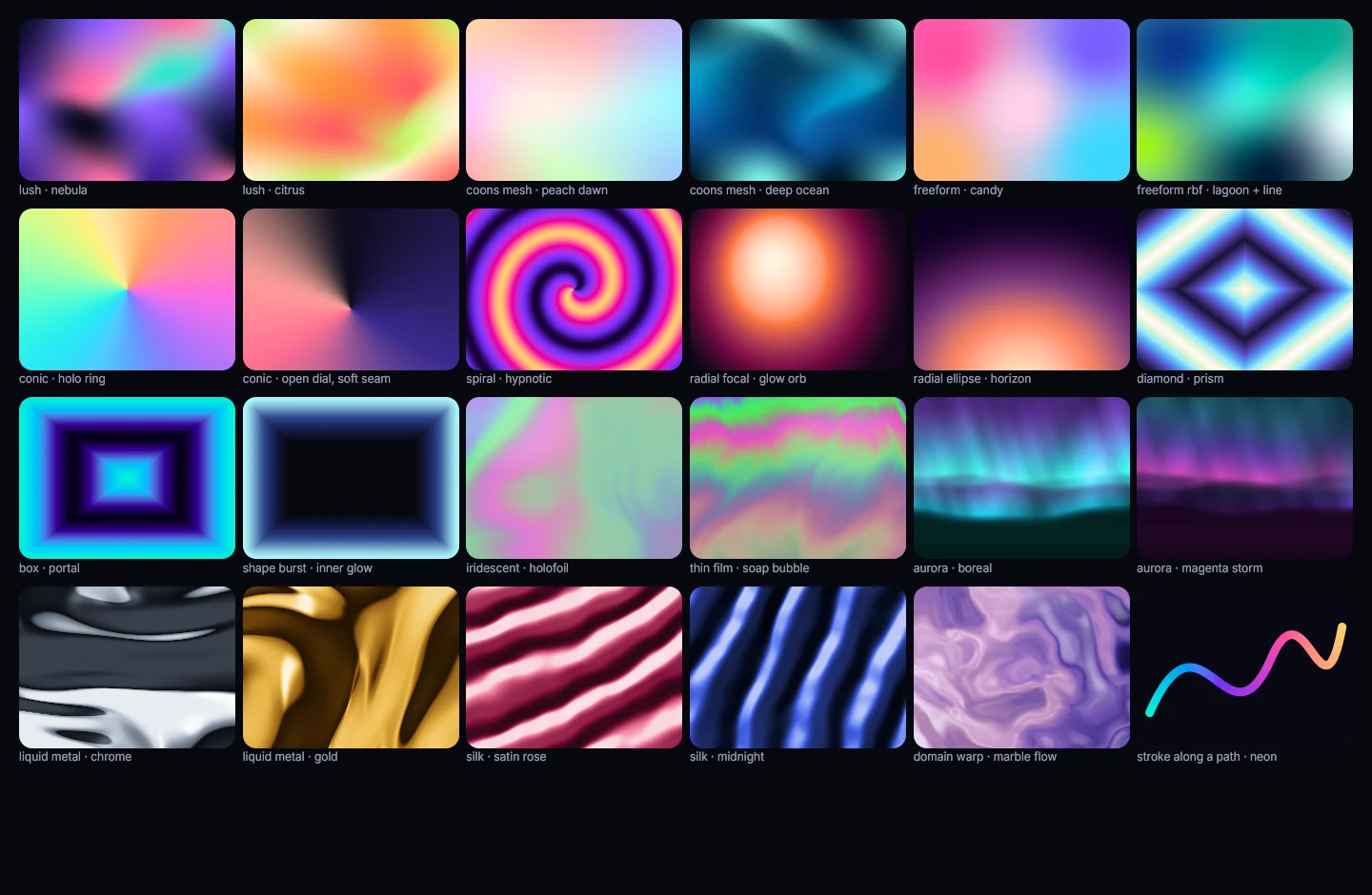
Colours blend in even steps, with no stripes.
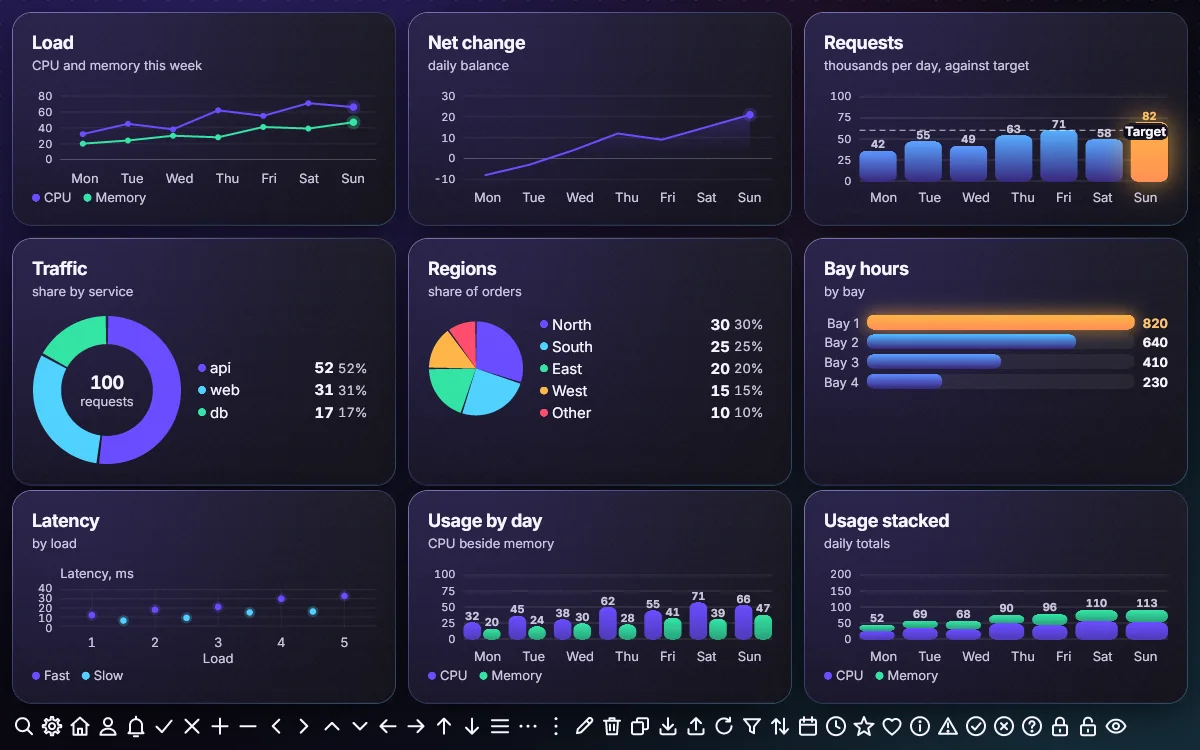
Start from one accent colour and get a full theme, every text pair checked for contrast.
A product team ships a desktop app and a web dashboard. Both use the same tokens and draw the same pixels, so design reviews one build, not two.
A designer asks for a toast to slide in over 220 ms. The developer renders every frame of it as images. Design approves the exact frames that ship.
Every screen goes through a contrast check in every theme. The app follows the system's contrast, motion and text-size settings.